Nook for Mac · Brand guide · Public beta 0.1
A little space, a few rules.
Everything that makes Nook look, move and talk like Nook. Pick an accent at the top — the whole guide wears it, the way the app does on your Mac.
01 · The mark
The mark is the product.
Drawn from the app icon's own layers. It tells a tiny story when it appears: the arch rises, a notch drops in and widens into the island, then the dot and the bars light up.
Clear space
Keep one island-height of space on every side — about an eighth of the mark.
Smallest size
Down to 24 px the full mark holds. Below that, in the menu bar, use the one-color glyph.
Don't
Recolor the arch, outline the tile, put it on a busy photo, or rotate it. The accent is the only thing that changes.
The wordmark
“nook”, where the double O is the island — with the same dot and waveform as the mark. Animated, the two O's merge, stretch into the island, and light up.
02 · Color
One accent. Everything else is Apple's.
Nook ships in Honey and lets people pick from ten more — or follow their Mac. Each accent has three shades. Click any hex to copy it.
The accents
Accent text uses the deep shade on light backgrounds and the light shade on dark ones, so it always reads. Bright accents carry dark ink. Pick one to dress the guide.
03 · Type
Rounded in the notch, tight on the page.
The app speaks in SF Pro Rounded, so a black shape in the notch still feels friendly. The site and this guide use Geist with tight headlines.
App · SF Pro Rounded
All clear for today
Drop files here to keep them close
24:12
Semibold for what you glance at, regular for the rest. Numbers are tabular so timers don't wobble.
Site · Geist
Your notch.
Now a nook.
Headlines bold at about −4% tracking; body at 17 px with room to breathe.
Geist Mono — 295 KB → 22 KB · −92%
04 · The island
One glance, one thing.
The island grows ears for what matters right now, by priority: open beats everything, a key press beats a toast, a recording beats music. These are the app's own snapshots, in the accent you picked; the rest is on the landing page.
The cover on the left, the waveform on the right, in your accent.
Sizes come from the notch itself (185 × 32 pt on a 14-inch MacBook Pro); every change is the quick token, opening is 220 ms.
05 · Motion
The more you see it, the less it moves.
Every animation picks one of five tokens, all under 300 ms except delight. Things seen a hundred times a day get no bounce, blur, stagger or squeeze. Reduce Motion swaps everything for a 120 ms fade, and Nook idles at about 0% CPU.
micro
100 ms · Constant
Hovers, level bars, slider updates
quick
160 ms · 100+ a day
Closing, closed-island swaps, tabs
standard
200 ms · Occasional
Toasts, the Duo bubble, Shelf, buttons
open
220 ms · All day
Opening the island — no bounce
delight
400 ms · Rare
Rare or first-time moments, like Welcome
06 · Voice
Short, kind, plain.
Nook talks like a friend who's good with computers: it says what happened and what you can do next, in as few words as it takes. Numbers are real — measured, never promised.
07 · Files
Take the mark with you.
The originals from the app's own icon layers. Use them as they are; the accent is the only thing you may change.
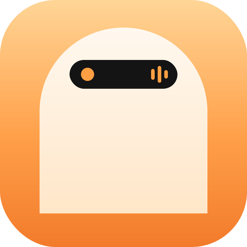 nook-mark.svg1.2 KBSVGThe full-color mark. Any size from 24 px up.Download ↓
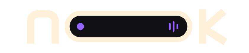 nook-wordmark.svg1.3 KBSVGThe wordmark in cream with a violet island, for dark backgrounds.Download ↓
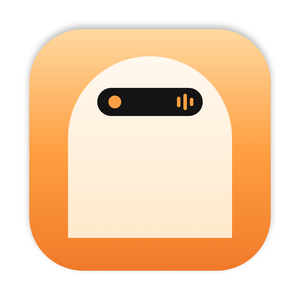 app-icon-1024.png239 KBPNG · 1024 pxThe macOS app icon, for stores, press and slides.Download ↓
 menu-bar-glyph.svg394 BSVG · templateOne color, for the menu bar and anything under 24 px.Download ↓
 icon-layer-front.svg437 BSVG · layerFront layer: the island, its dot and waveform. For Icon Composer's Liquid Glass icon.Download ↓
 icon-layer-back.svg172 BSVG · layerBack layer: the white arch. Icon Composer fills the tile with the accent.Download ↓