All work

Sunshine Bronze

A Brand Built From Scratch, Down to the Rules

A natural-tanning studio asked for a logo. It got a brand built from scratch — essence first, identity second — and a living guide the owner opens before every post.

Role

Brand Strategist & Designer

Year

2026

Team

Solo

Client

Sunshine Bronze

  • 01Sunshine Bronze is a natural-tanning studio in Biguaçu, Santa Catarina: one owner, a loyal clientele and an Instagram account — but visually, the brand did not exist yet.
  • 02An evidence audit of her own posts found the gaps: a script logo with metallic gold that contradicted who she is, cold colors she had explicitly asked to avoid, and a tone that begged instead of led.
  • 03So the order was fixed up front — verbal before visual, photo before logo — and every decision had to trace back to her own answers in the brand questionnaire.
Sunshine Bronze interface
01

The brand that already existed

Every sin the new rules would later forbid was in the original mark: a cursive name, metallic gradients, thin generic rays. Drag to see where it ended up.
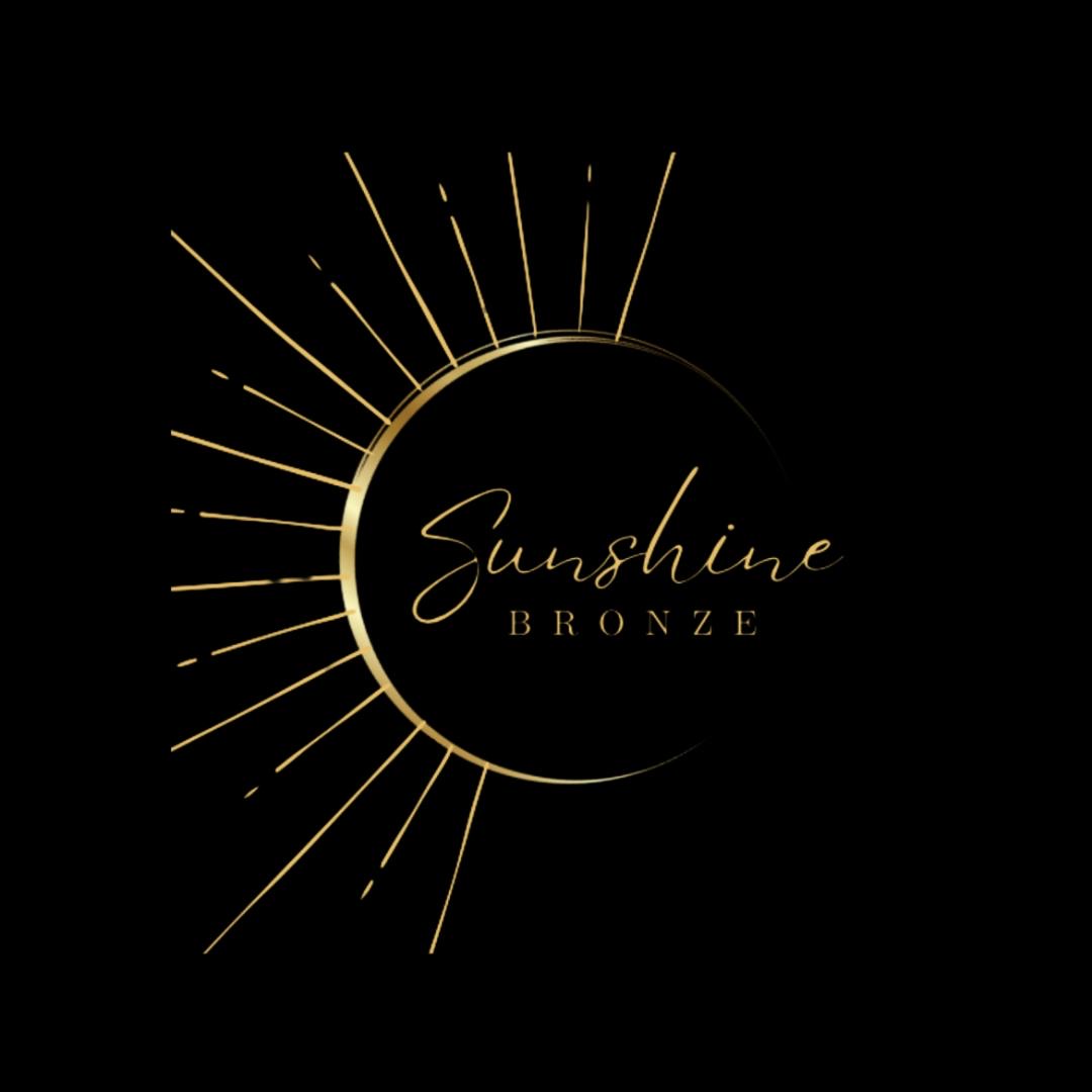
The original Sunshine Bronze logo: script lettering inside a thin metallic-gold ring with fine rays
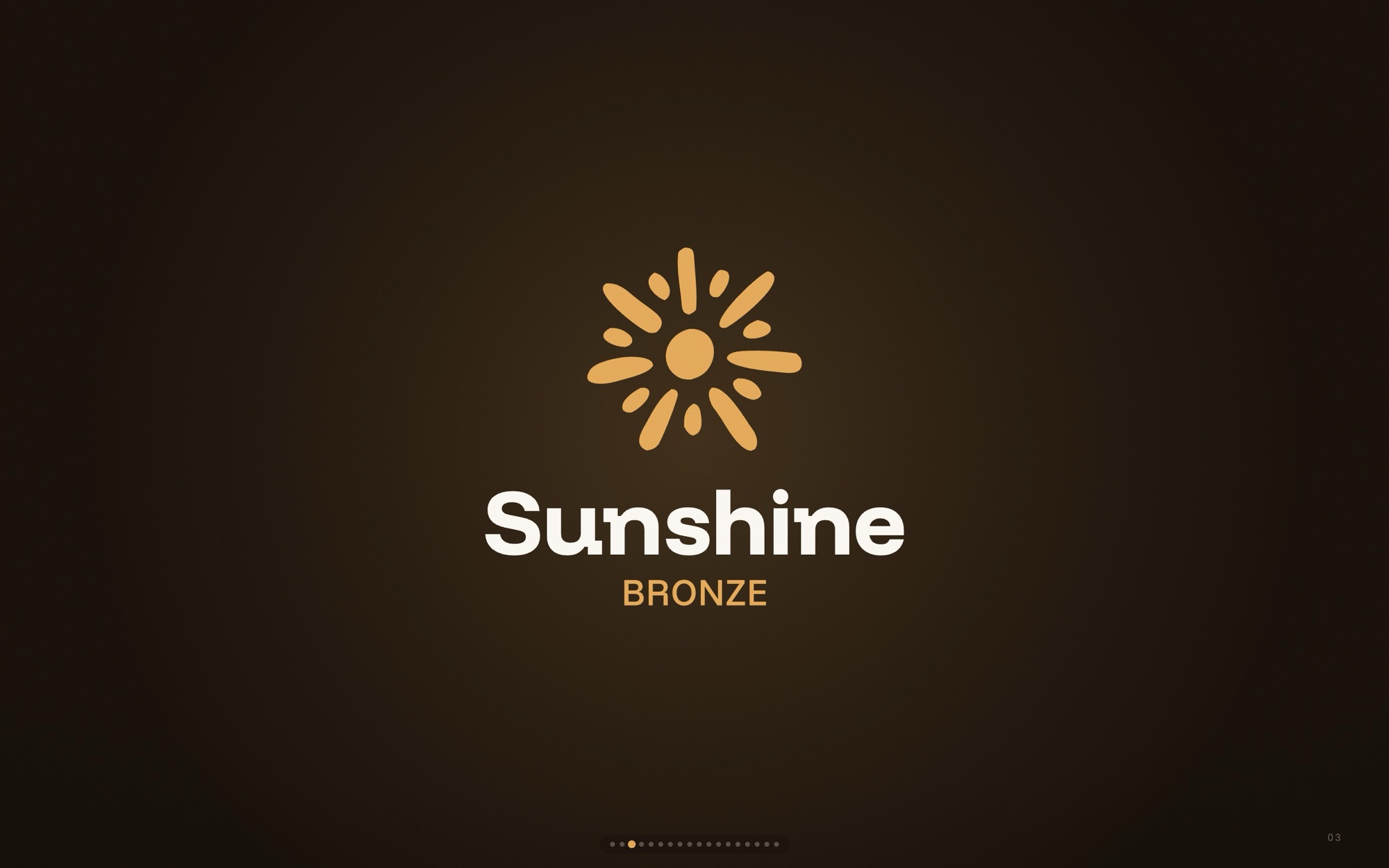
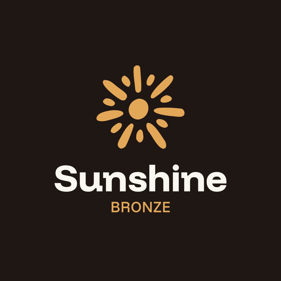
The new Sunshine Bronze signature: a hand-drawn golden sun over a heavy cream Sunshine logotype and BRONZE in gold
BeforeAfter
02

Brand is not the logo

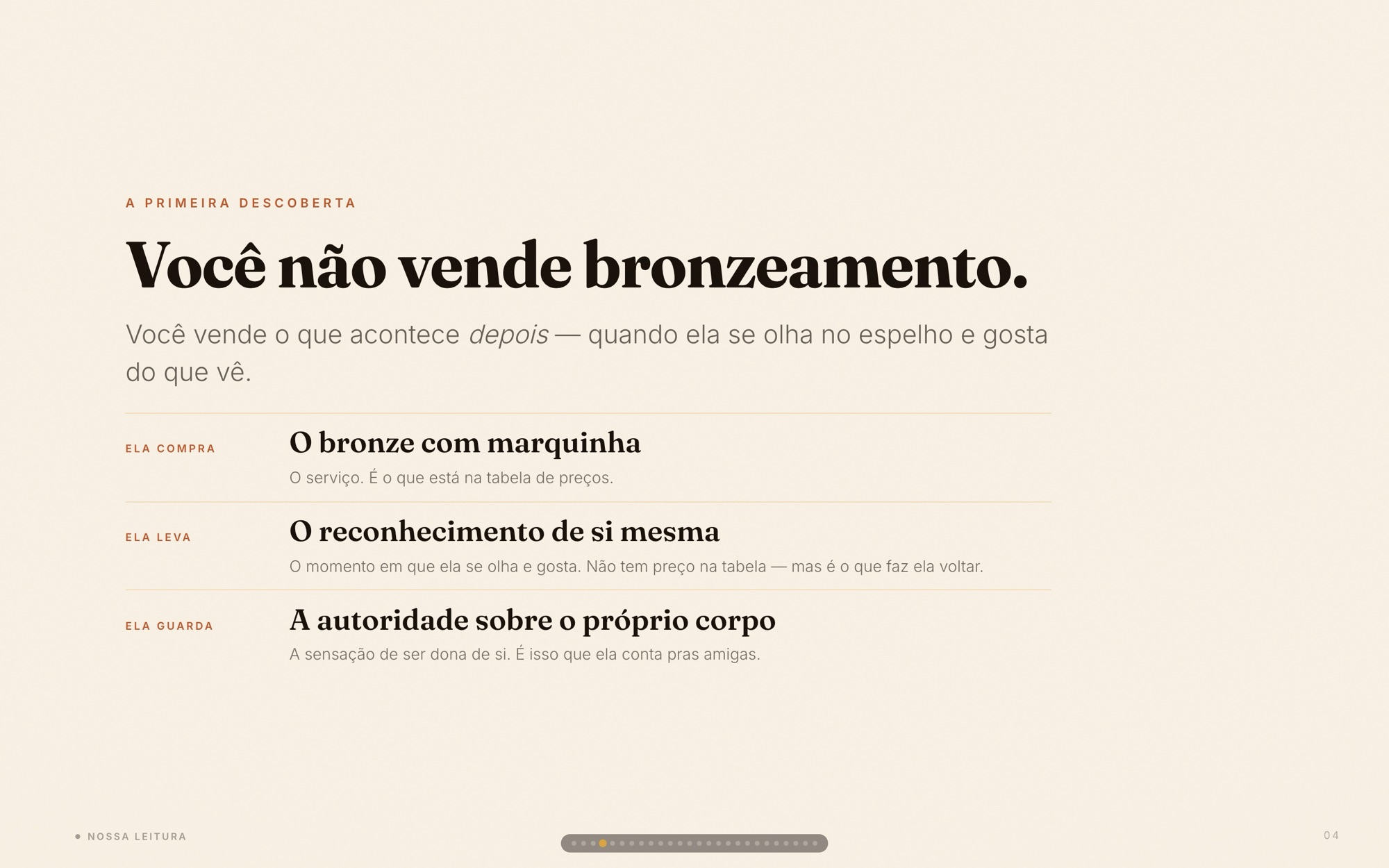
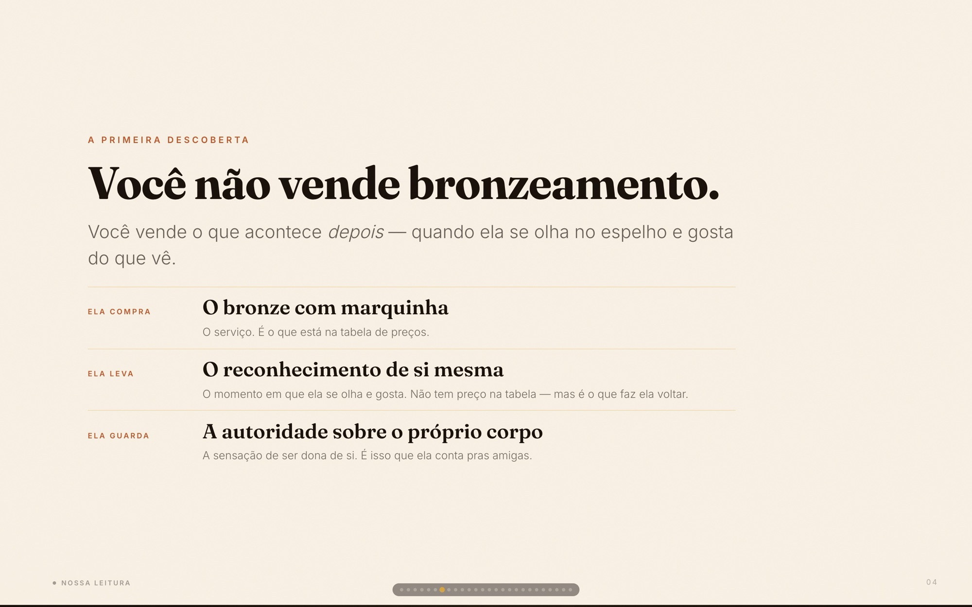
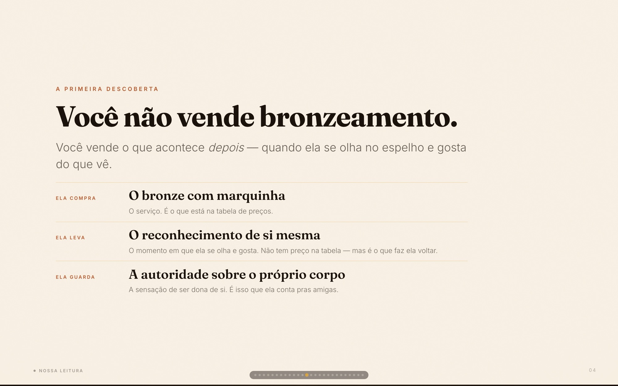
Chapter one, the essence, came before any drawing. Its first finding reframed the business: she does not sell tanning — she sells what happens after, when a woman looks in the mirror and likes what she sees.
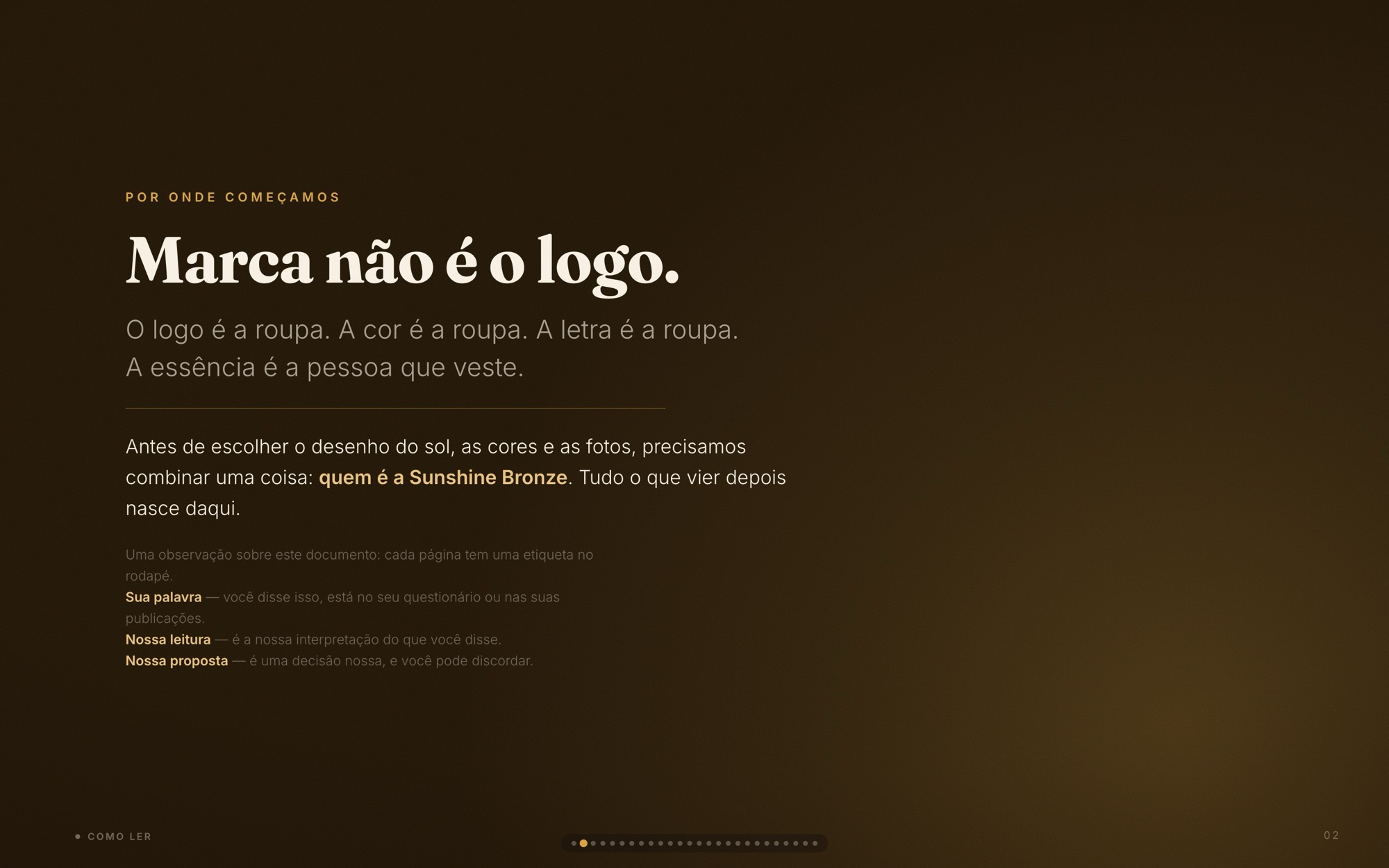
Essence deck slide: "Marca não é o logo." — the logo, color and type are the clothes; the essence is the person wearing them
“Marca não é o logo.”
Essence deck slide: "Você não vende bronzeamento." — she buys the tan line, takes home self-recognition, keeps authority over her own body
What she actually sells
03

She doesn’t serve. She leads.

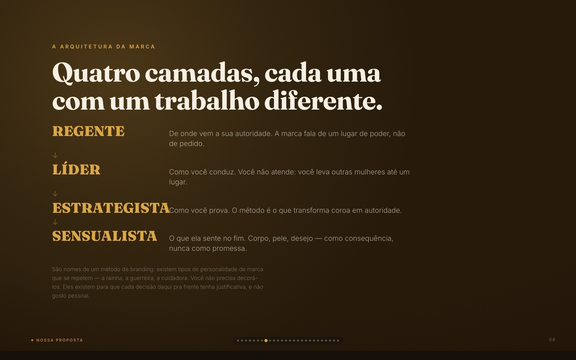
The archetype reading landed on Regente — the Ruler — read from the owner’s own words: “virar rainha do bronze”, “seja marcante”. Built in four layers, each with a different job: Ruler at the core, Leader in personality, Strategist as proof, Sensualist in expression.
Essence deck slide: "A Sunshine não atende. Ela conduz." comparing how other studios talk with how Sunshine talks
“Não atende. Conduz.”
Essence deck slide: four archetype layers — Regente, Líder, Estrategista, Sensualista — each with its role
Four layers, four jobs
04

The Sovereign and the Magnetic

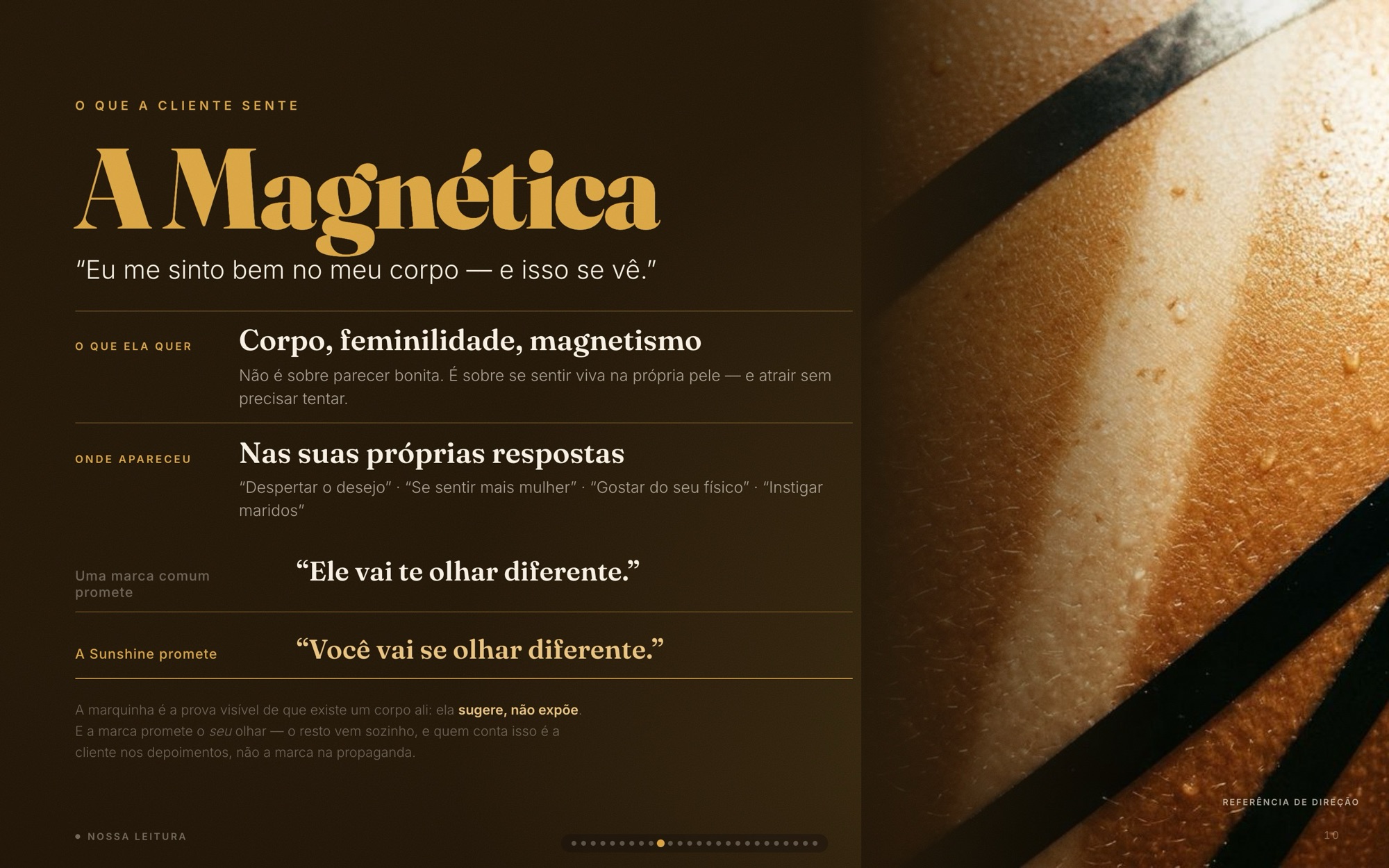
Two figures carry the brand: A Soberana — who the brand is, power that brings others along — and A Magnética, what the client feels in her own body. The order matters more than either: the Sovereign leads, the woman recognizes herself, and the magnetism follows.
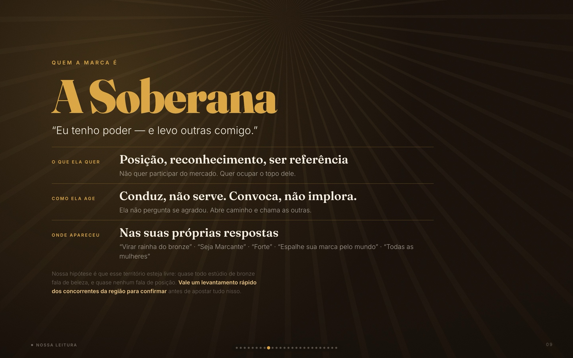
Essence deck slide: "A Soberana" — "Eu tenho poder — e levo outras comigo."
A Soberana — who the brand is
Essence deck slide: "A Magnética" — "Eu me sinto bem no meu corpo — e isso se vê", beside a sunlit tan line
A Magnética — what she feels
05

Seja Marcante

Positioning in two words, read two ways: the mark on the body, and the mark you leave on the world. The voice follows the crown — “quem tem coroa convoca, não implora”: no “book your slot”, but “your place is marked”.

Essence deck slide: positioning "Seja Marcante" — the tan line on the body, and the mark you leave in the world
Positioning — a double meaning
Essence deck slide: "Quem tem coroa convoca. Não implora." — rewrites of begging captions into leading ones
Voice — convoke, never beg
06

The mirror is the product

The most important moment in the studio is not the session — it is the mirror after it. That moment became the brief for the photography, and “rainha do bronze” stopped being a nickname and became a position.
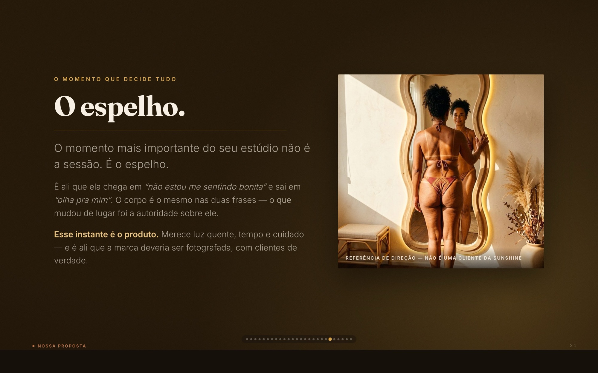
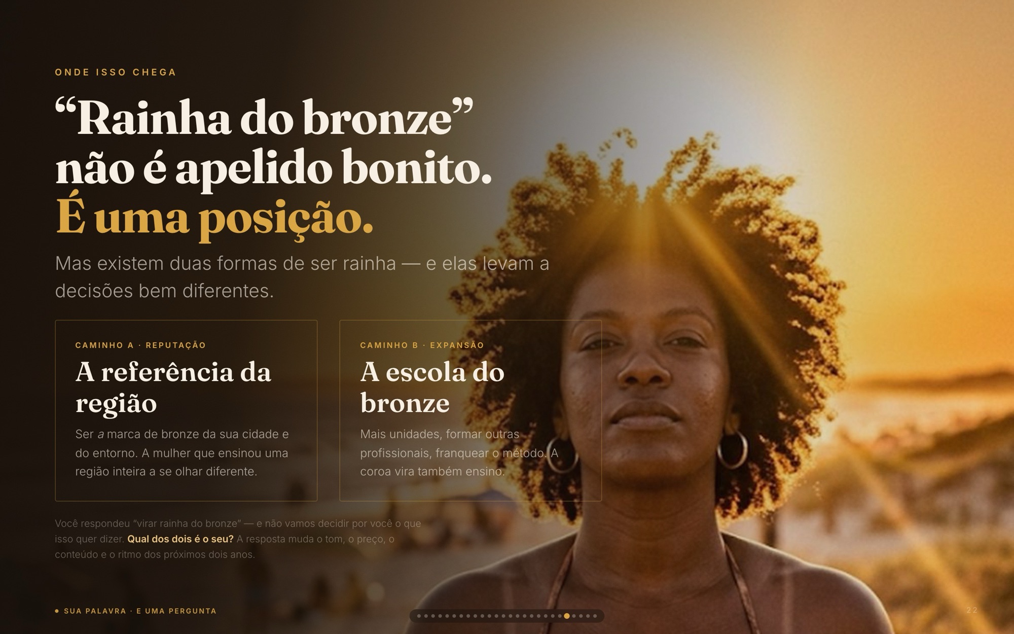
Essence deck slide: "O espelho." — the moment a client looks in the mirror after the session
“O espelho.”
Essence deck slide: "Rainha do bronze não é apelido bonito. É uma posição." over a woman in golden-hour light
A nickname turned position
07

Nothing chosen by taste

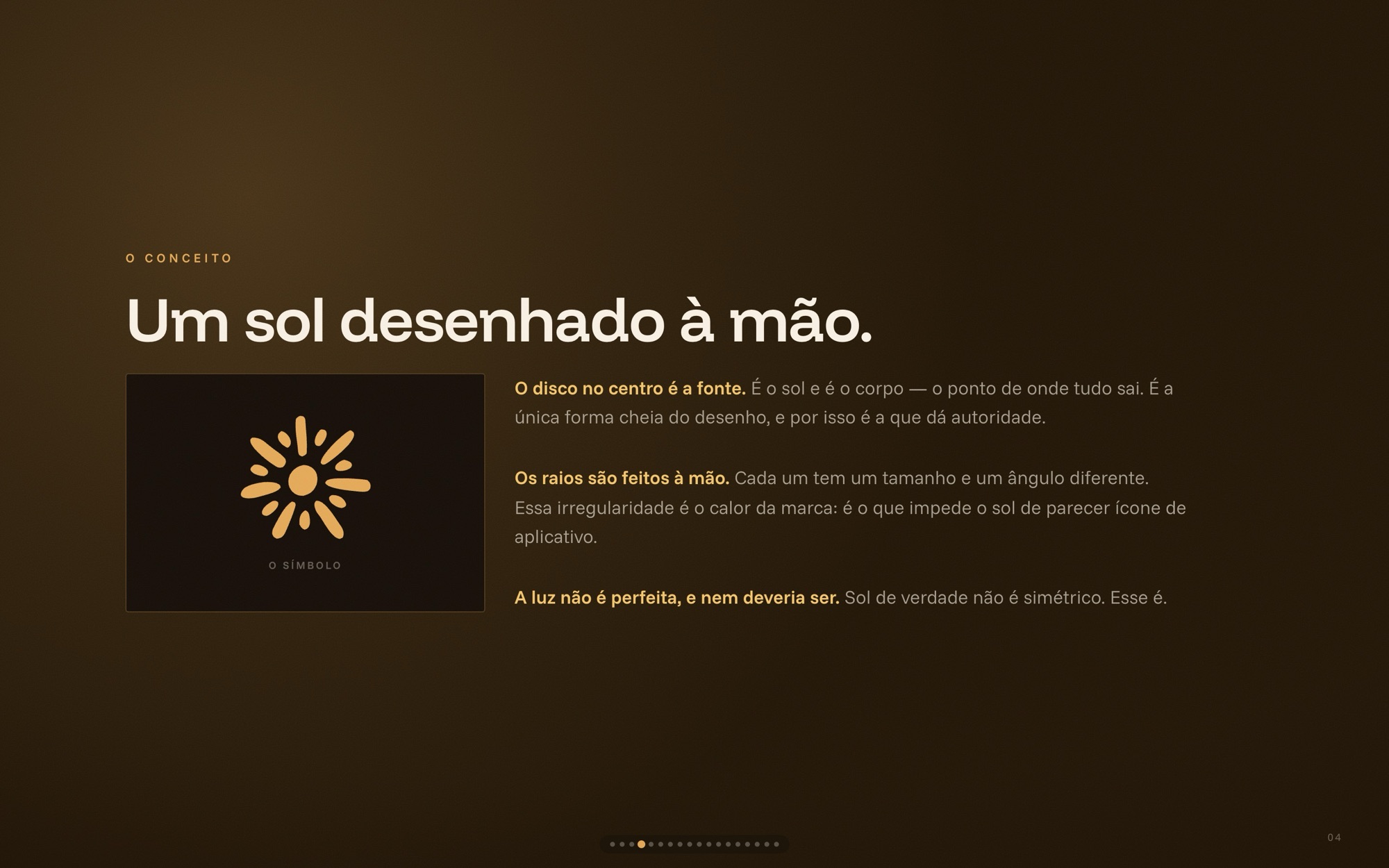
Chapter two, the identity, maps every visual decision back to a trait. The sun went through three degrees of organicity before the hand-drawn one won: a solid disc for authority, irregular rays because real suns are not symmetric — and because perfect geometry reads as an app icon.
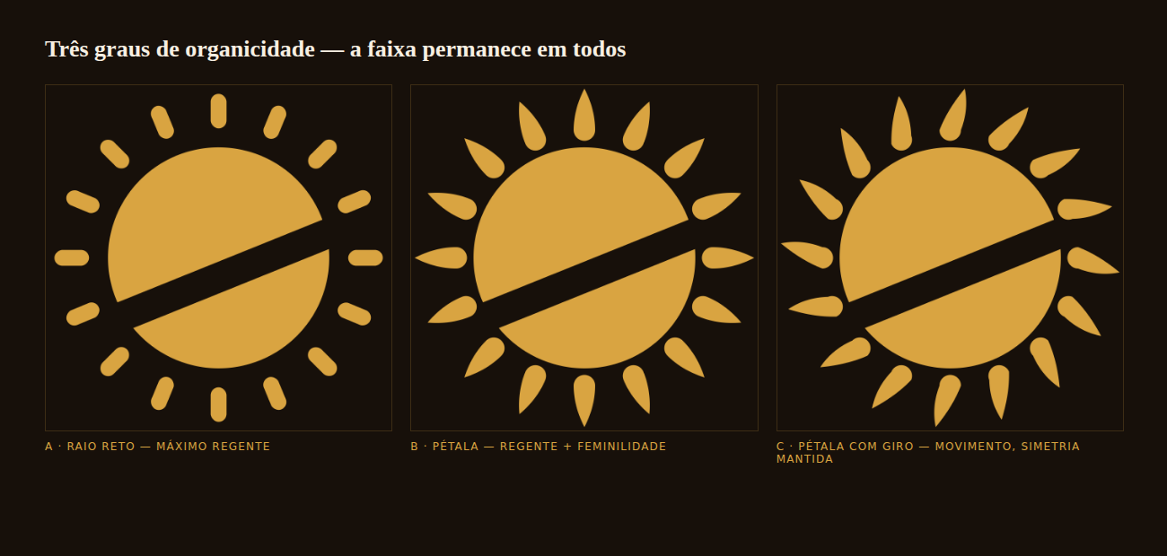
Symbol exploration: three suns with a tan-line band — straight rays, petal rays, and petals with a turn
Exploration — three degrees of organic
Identity deck slide: "Um sol desenhado à mão." — the final symbol and the reasoning behind its irregular rays
The one that won
08

One system, any ground

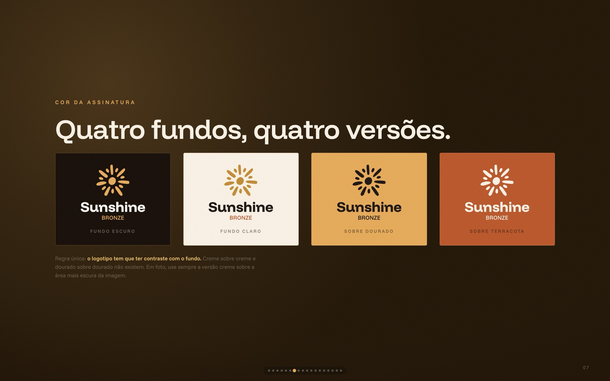
Vertical for the profile and the studio wall, horizontal for wide spaces; four colorways so the signature always contrasts with what it sits on.
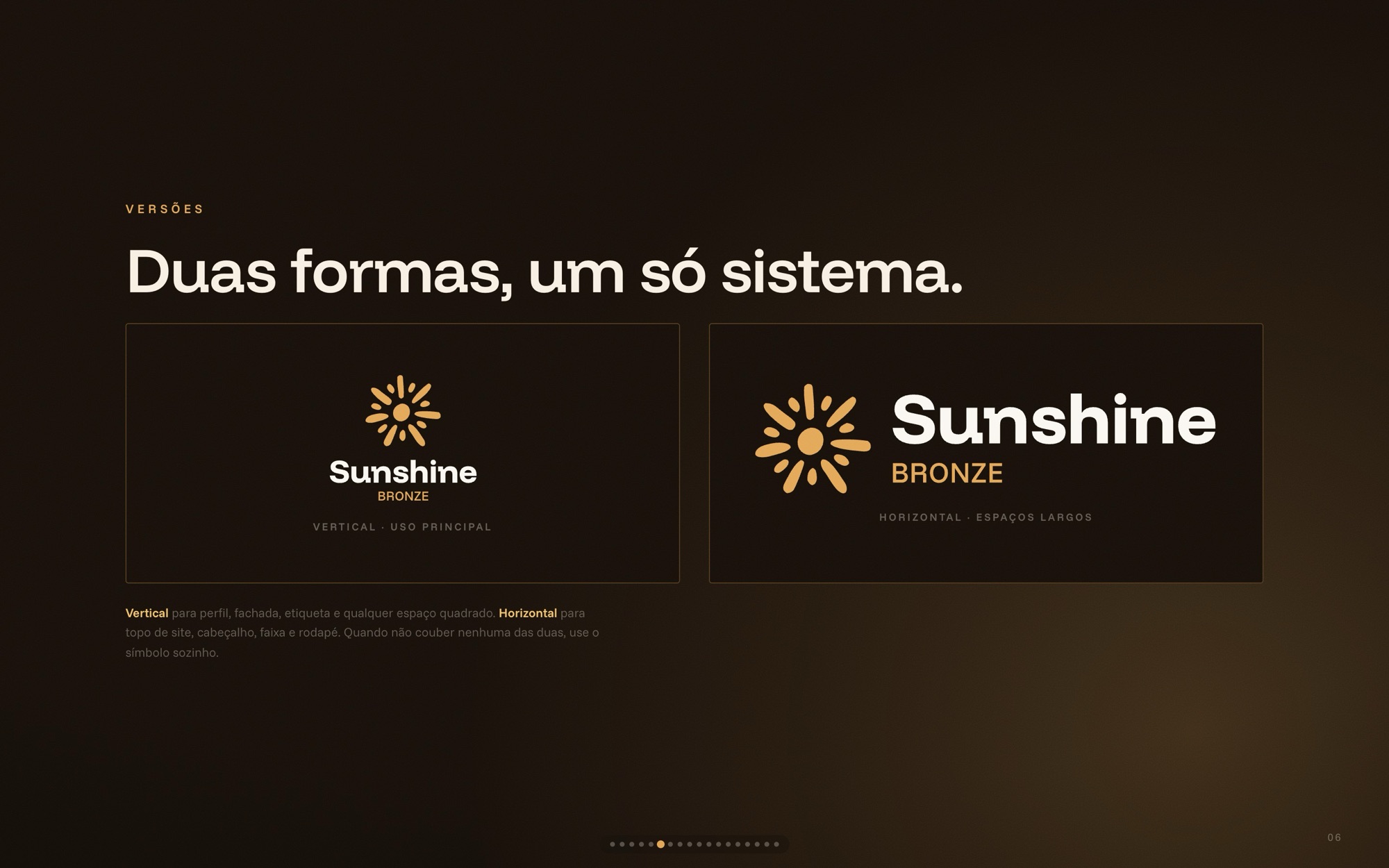
Identity deck slide: vertical and horizontal versions of the signature
Two forms, one system
Identity deck slide: the signature on café, creme, dourado and terracota backgrounds
Four grounds, four versions
09

Color from the sun, type with weight

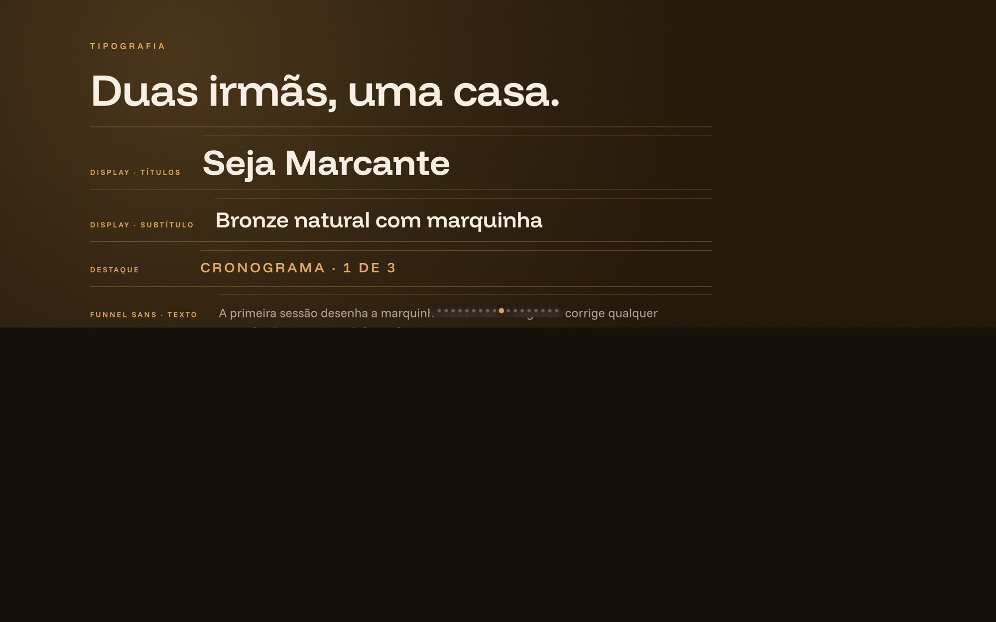
Dourado is the brand color — the symbol and BRONZE; café is the default ground, terracota and bronze for highlights. Two sister typefaces from one family: Funnel Display to shout, Funnel Sans to explain. No script, anywhere.
Identity deck slide: "A cor vem do sol." — the warm palette from sol to café
The palette
Identity deck slide: "Duas irmãs, uma casa." — Funnel Display and Funnel Sans in use
Two sisters, one house
10

The photo is 90% of the brand

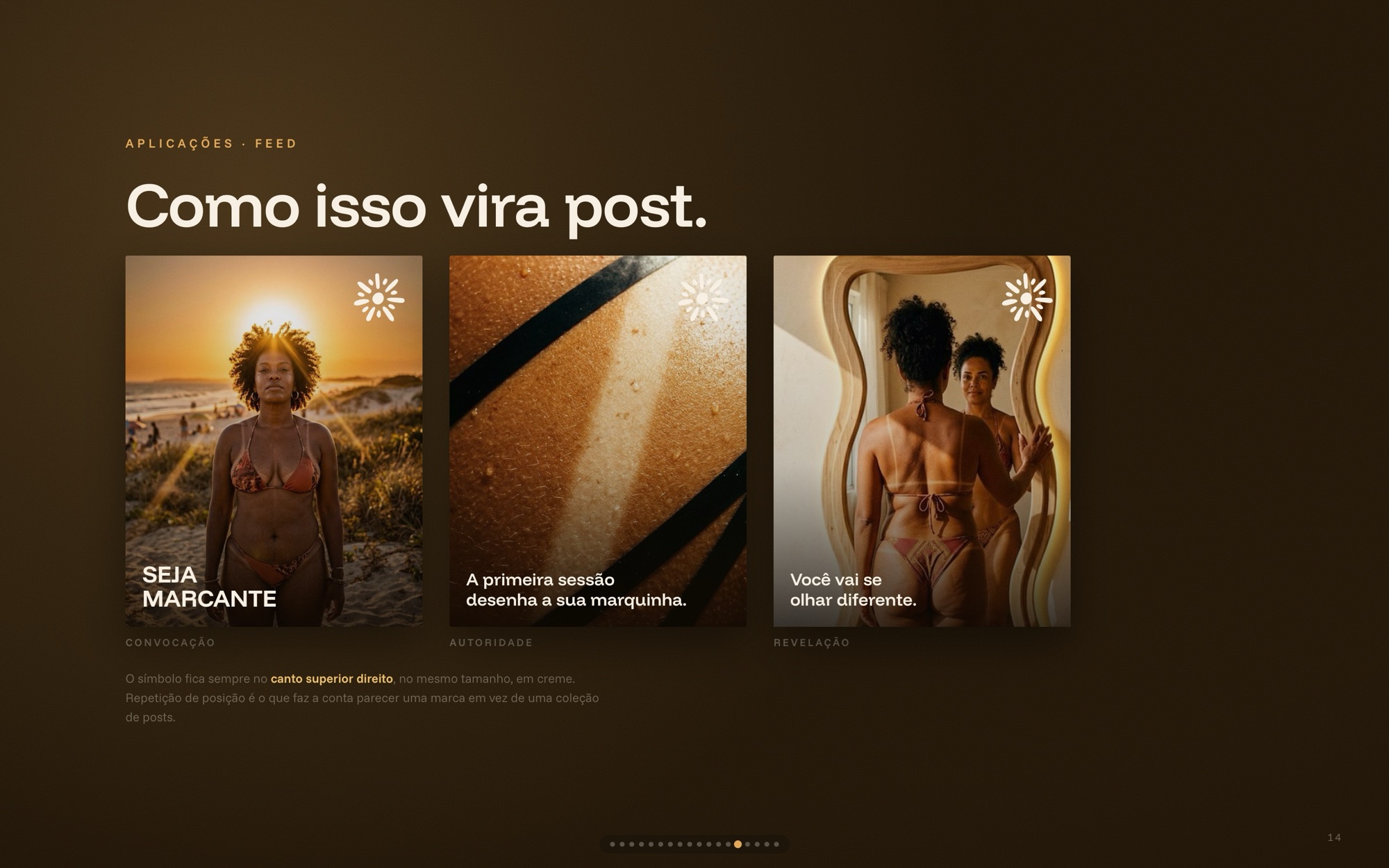
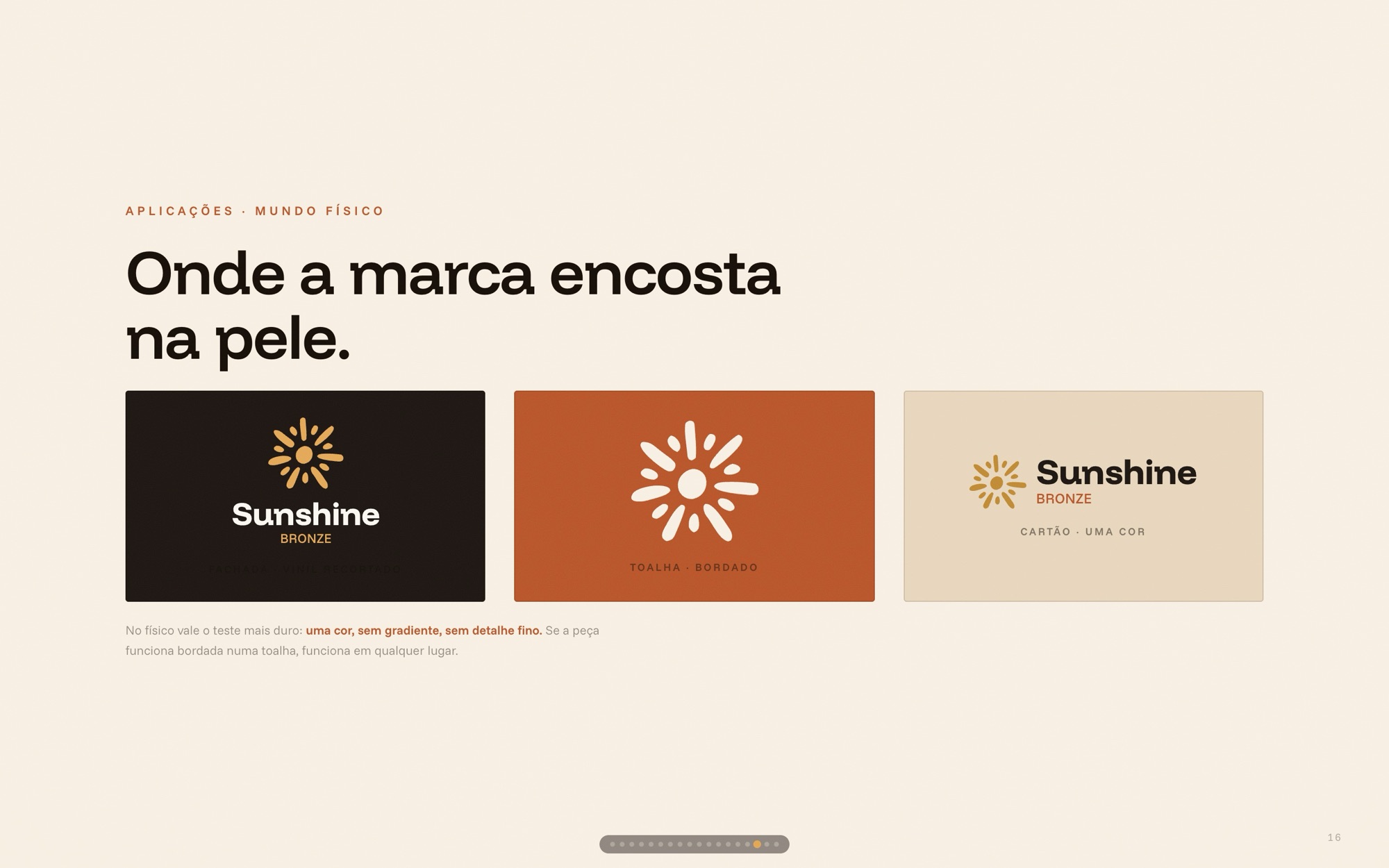
Photo before logo: light, body, gaze and place were defined before any post template. Then the templates — symbol always top-right, the cream tarja as the house signature — and the physical world, where the mark touches skin.
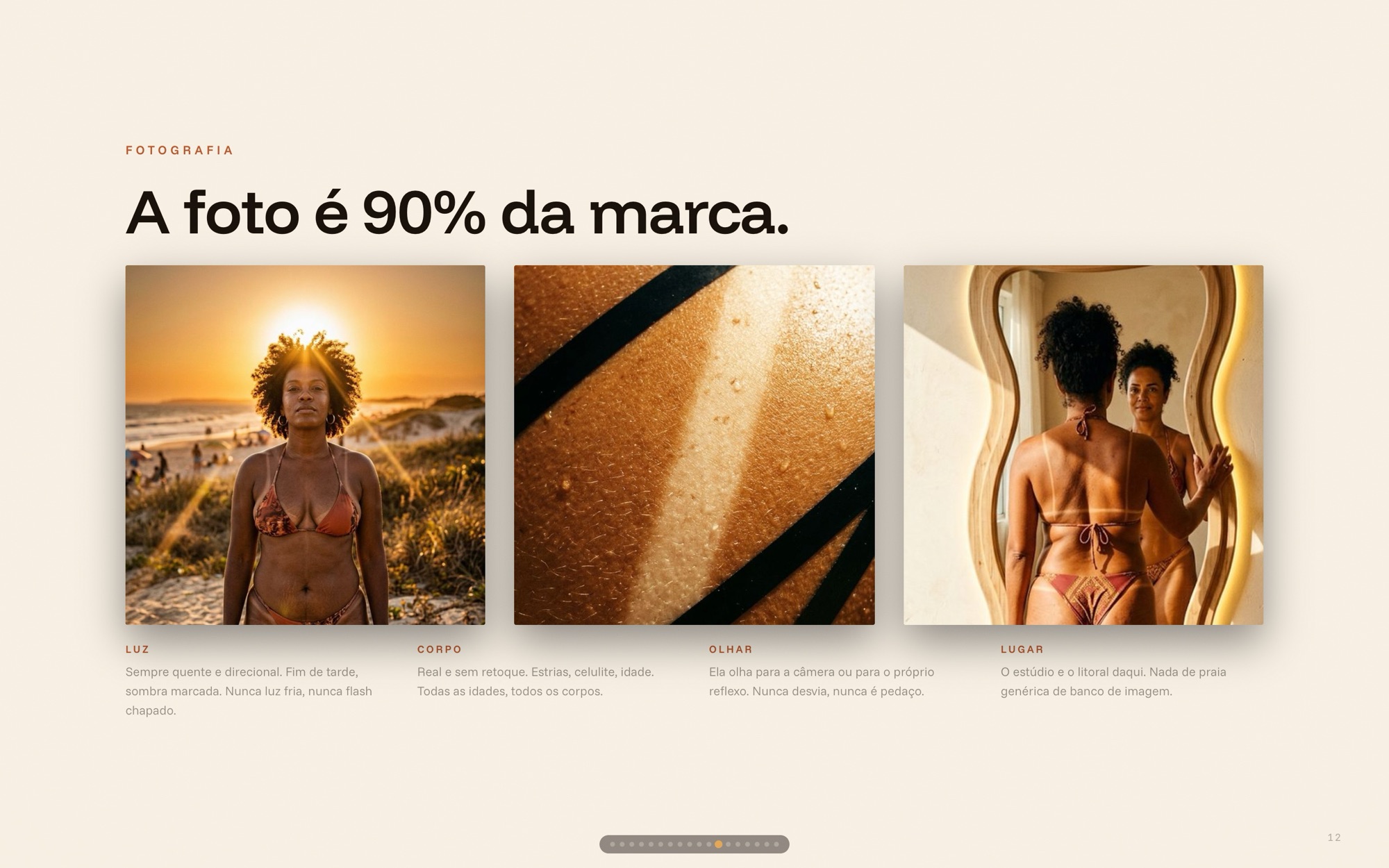
Identity deck slide: "A foto é 90% da marca." — light, body, gaze and place, with three reference photos
Light · body · gaze · place
11

From brand to feed

Identity deck slide: "Como isso vira post." — three post templates: convocação, autoridade, revelação
Three post types
Identity deck slide: "Onde a marca encosta na pele." — studio signage, terracota and cream applications
Where the brand touches skin
12

Then it became software

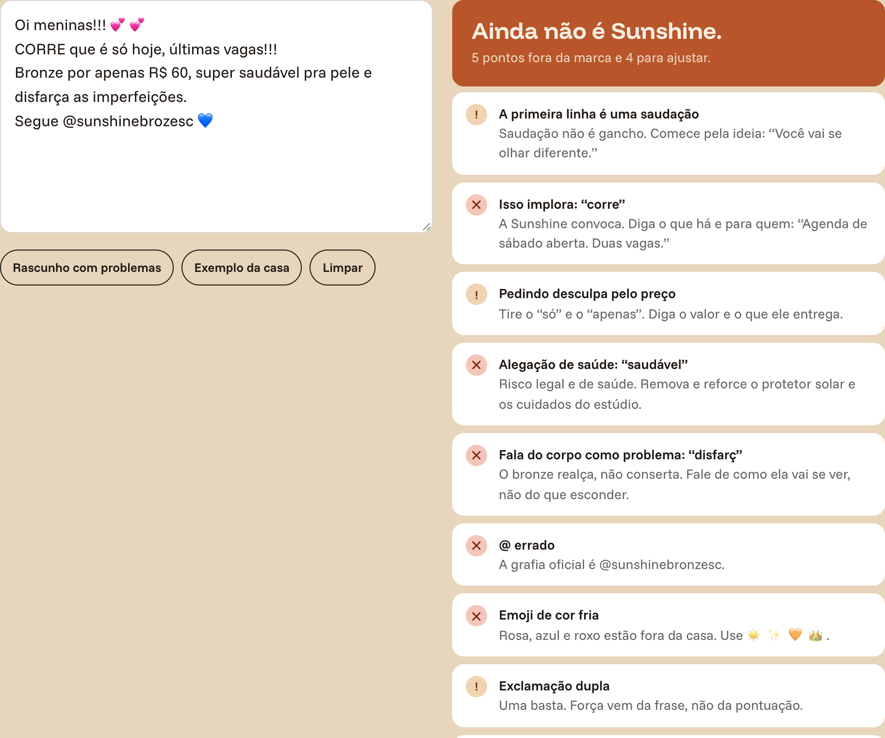
There is no designer on call — the owner posts everything herself — so the rules had to run without one. The guide is software: the logo lab lets you commit every sin — stretch, rotate, script, cold color — and names each one as you toggle. The voice checker reads a caption like the brand would: a pasted draft comes back “Ainda não é Sunshine” with five violations flagged, health claims and body-as-problem language among them.
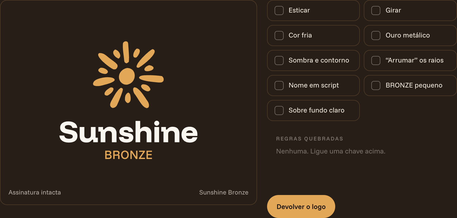
The break-the-logo lab: toggles for stretch, rotate, cold color, metallic gold, script name — the stage shows the intact signature
Break it here, not in production
The voice checker verdict "Ainda não é Sunshine" flagging a greeting hook, a health claim, body-as-problem wording and a wrong handle
“Ainda não é Sunshine” — 5 flags
13

From guide to feed

The last section builds the actual post: pick a type, a background, a tarja, type the headline — the checklist confirms the rules as you go. The guide ends where the work starts.
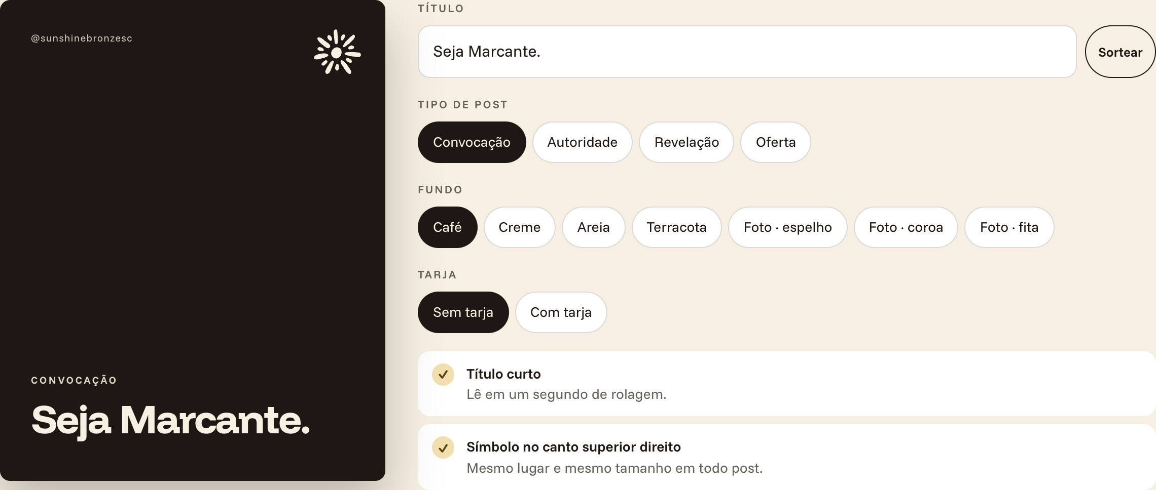
The post builder: a café-brown 4:5 post preview reading "Seja Marcante." beside controls for post type, background and tarja
Post builder — rules applied as you type
14

The guide, live

Not a screenshot — the deliverable itself, embedded. Scroll it, break the logo, score a pairing, paste a caption into the voice checker.

Interactive — the real thing

“O sol faz de graça. A Sunshine faz certo.”

— Her best answer in the whole questionnaire — asked about competitors, she named the sun